Should you trust the stock market? Part I
Historically, the returns have been good on the Dow Jones or the S&P 500. But, as every financial advisor cautions, past performance is no guarantee of future results.
Dow Jones (all-time, also note the log scale—this graph has a much steeper incline than it appears at first glance; see below):

Dow Jones (all-time, labeled with some historical highlights):

S&P 500 (since 1950, including adjustment for inflation):

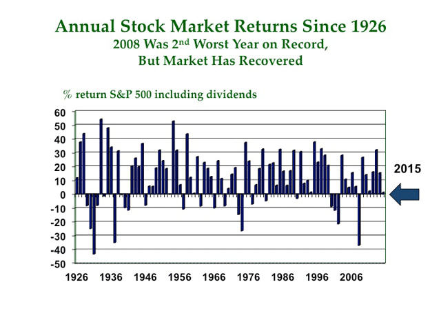
Or, for those who would prefer an annualized chart of S&P 500 returns, here you go (all-time--note that the S&P 500 was called the "Composite Index" before 1957):

Notably, John Bogle (the founder of The Vanguard Group, an investing company) is not optimistic in the short-term: http://www.marketwatch.com/story/john-bogle-says-you-wont-make-much-money-from-stocks-2015-11-05
So, should you be optimistic? Is it wise to invest in the stock market? Is the market really trustworthy?
You don't need my advice. Take a look at the graphs above and decide for yourself.


.PNG)